
Happy Hounds
This identity for a dog boarding company actually started life as a commissioned logo project. Whilst that agreement came to an end, I was having fun developing the graphic and wished to see it through to some kind of completion.
Logo Design / Client: Self
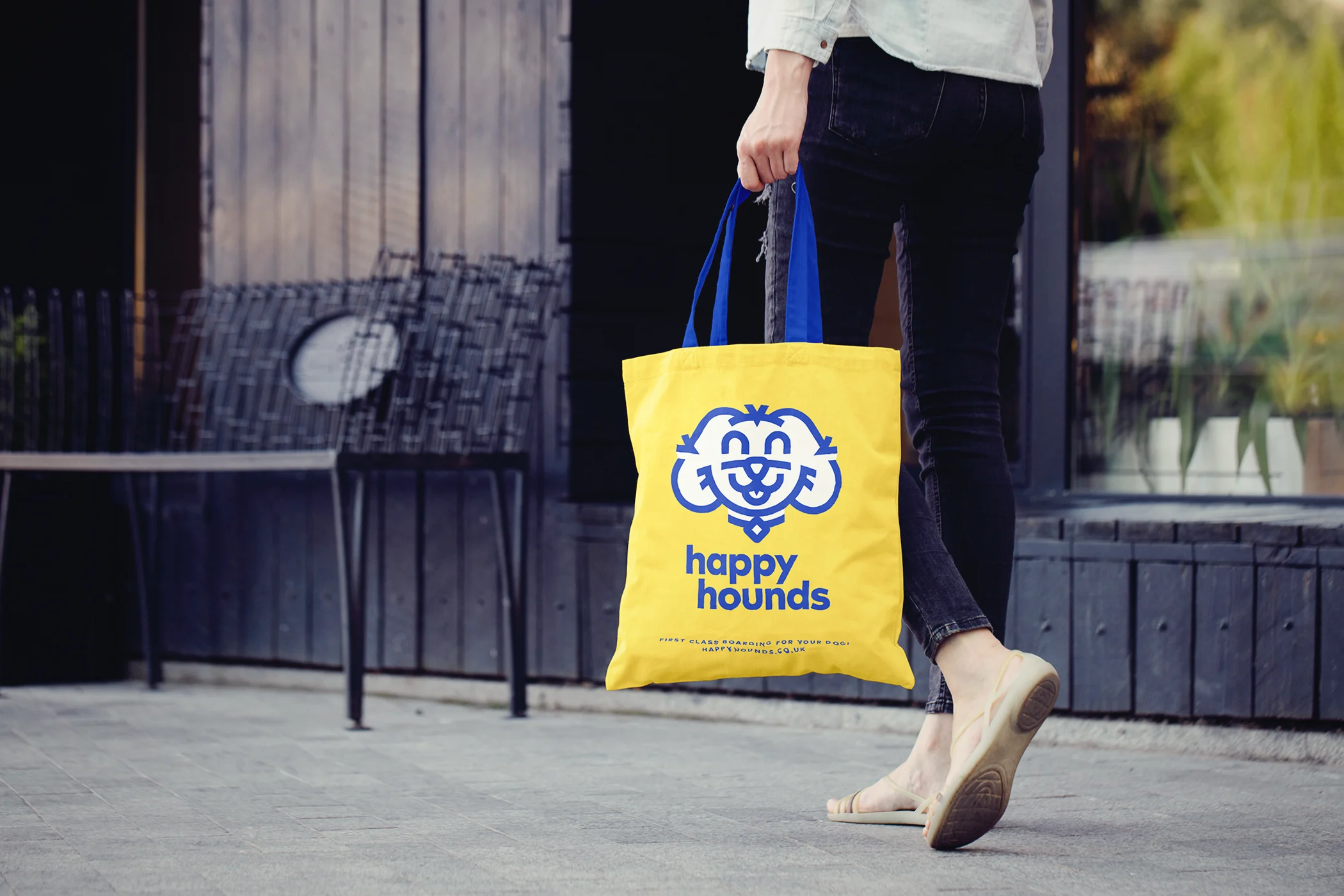
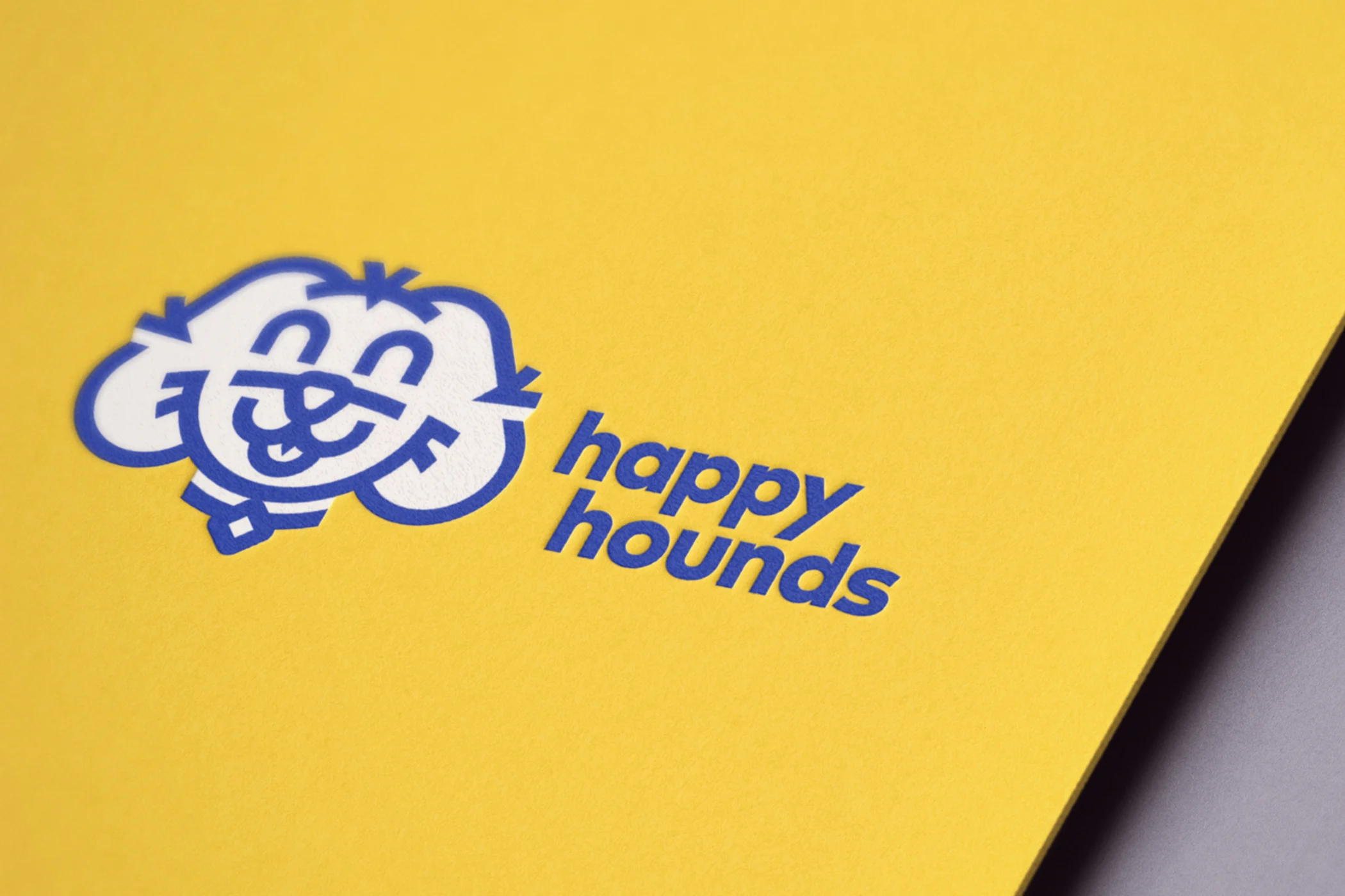
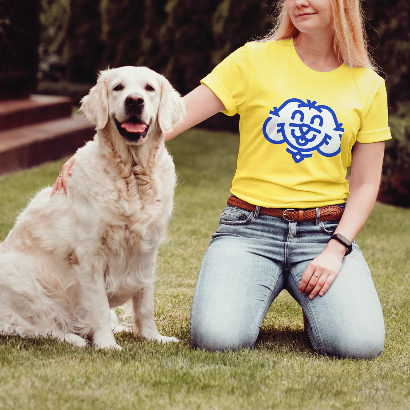
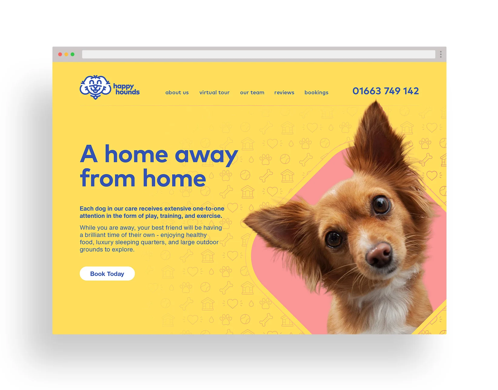
Based on circular shapes, this punchy graphic combines with bright colours to reinforce the company name and ethos. The rounded geometric typeface FF Mark ensures that the wordmark complements the icon.
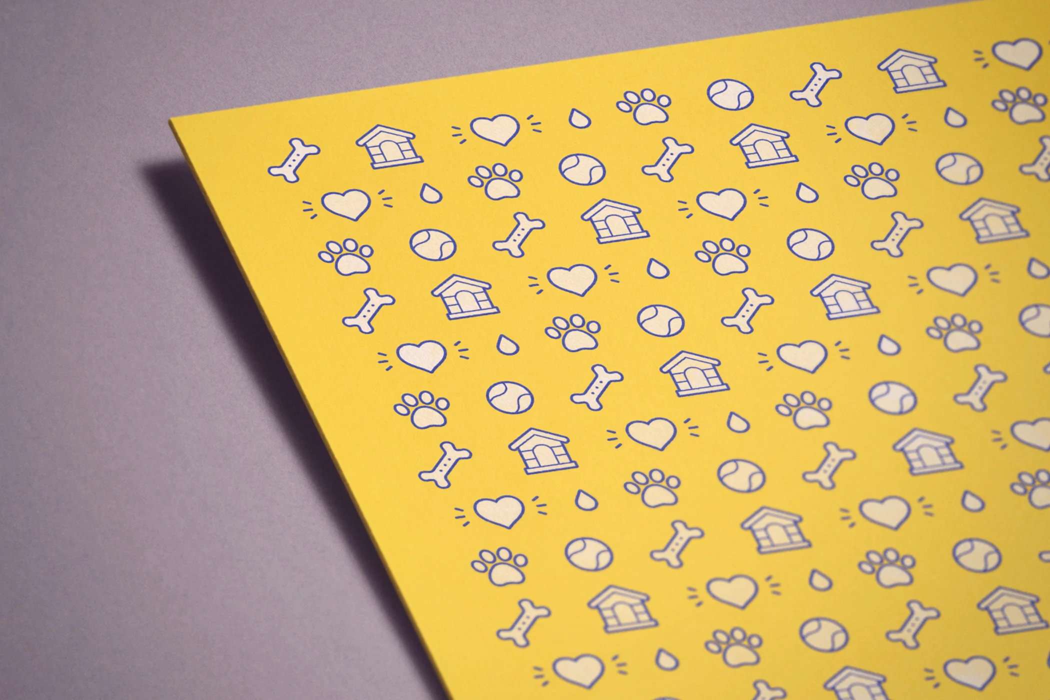
A pattern was also developed that can have many supporting applications, such as to the reverse of business cards.