I was approached by a Marple‐based brewer to develop an identity, as well as label designs, for his brand new ale. The client stated a preference for simple, bold graphics, and to break away from traditional illustrative beer labelling.
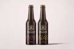
The identity was to embody Northern England — specifically, Manchester and the surrounding area; for which we agreed amongst other ideas, to explore the worker bee. This insect was adopted as a motif by Manchester during the Industrial Revolution — a time when the city was leading the world in new forms of mass production. The bee symbolises the hard work of Mancunians, and the city itself being a hive of activity in the Victorian era.
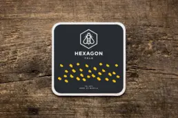
The resulting icon retains readability at varying scales and forms of application – from a bottle neck to signage. The labels combine this with a geometric typeface and a restrained aesthetic, creating an unusual look for this product type. The brush stroke pattern acts as a companion to the logo and abstractly represents busy workers.