Here is another trio of design-related sites for your bookmark list. This time featuring: a branding reference, typographic scales, and an outstanding icon set.

Brand Archive
Bookmark This 006.1
brandarchive.xyz
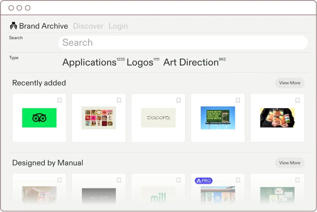
Brand Archive homepage ©Brand Archive Limited
Brand Archive is packed with inspirational visual case studies of contemporary branding activity. Select an example from the extensive collection and you will see the associated logo, animations, typography, colour palette, and art direction. Handily the site also shows how these elements come together in real-world application.
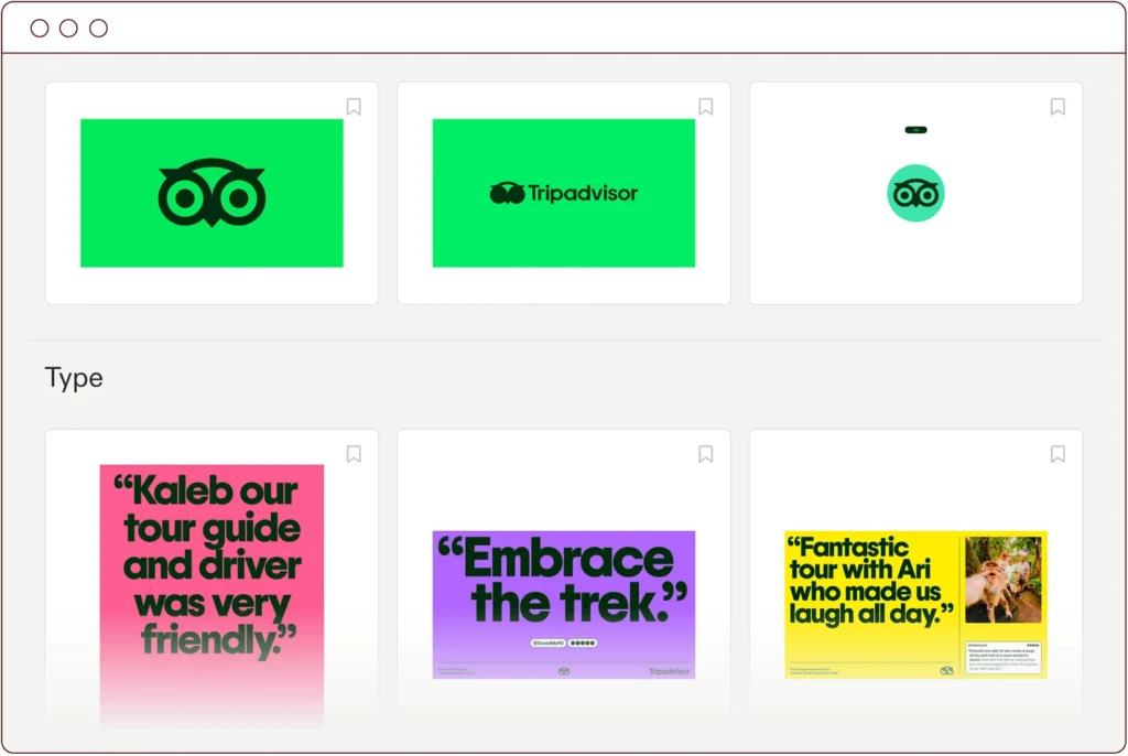
Tripadvisor study ©Brand Archive Limited
I would summarise this resource as being a much speedier version of browsing and comparing brand guidelines! There is a paid option which unlocks every entry, but you can certainly gain a lot from within the generous free tier.
From the same stable is the Brand Packaging & Opinion (BP&O) website, and Logo Archive. These are both similarly well curated and offer in-depth analysis of the industry.
GriddyIcons
Bookmark This 006.2
GriddyIcons
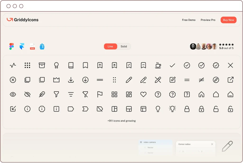
Homepage ©GriddyIcons
GriddyIcons has ambitions to become the world’s largest icon collection. You don’t need me to tell you that there are a multitude of icon sets out there, but this one stood out to me as being flexible, well-designed, and expanding. The library has been designed to sit somewhere in-between rounded and sharp styles and is visually unique for that reason. Icons are provided in outline (with adjustable stroke weight) or solid form, and importantly to me, have Iconjar integration. You can purchase the set as it stands today, or pay a one-off fee for a pro licence which entitles you to future updates.
Typescale
Bookmark This 006.3
typescale.com
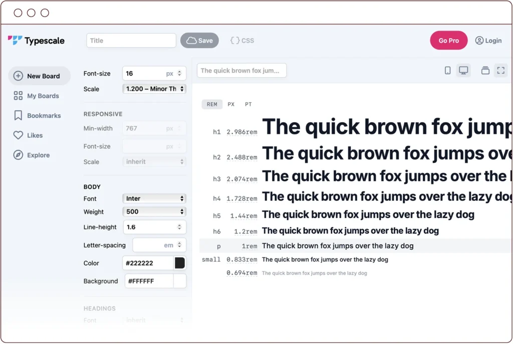
A typical Typescale scene ©Typescale
Setting up a typographic hierarchy for a document or website can involve a lot of trial and error. This tool helps you to quickly apply established design theory to the process — potentially removing the guesswork.
Starting off, you set a font size for your body paragraphs. This becomes your rem unit, acting as the foundation for the scale. Next you choose from one of eight pre-defined scaling systems. Font sizes for your headings and smaller text elements are instantly calculated and previewed. You can set this preview with an example from Google Fonts, and make other adjustments such as tracking, leading, and colour.
For a reasonable subscription, you can work with responsive sizing, change the heading font attributes, and explore user creations for inspiration. However, even without that extra functionality, this is a handy resource for any designer.
—
Header Image: by fidaolga on Adobe Stock. All links are posted in good faith, but NStudio does not accept responsibility for external websites, or content/functions therein. NStudio has no affiliation with the destination websites or their authors, unless stated above.