Over centuries, as type has developed, guidelines and best practices have emerged that, when followed, can ensure that textual content is clear and easy to understand. A clear message is surely the goal of graphic design.

The rules that follow are not intended to stifle creativity — but it is important to understand them before you can effectively ‘break’ them.
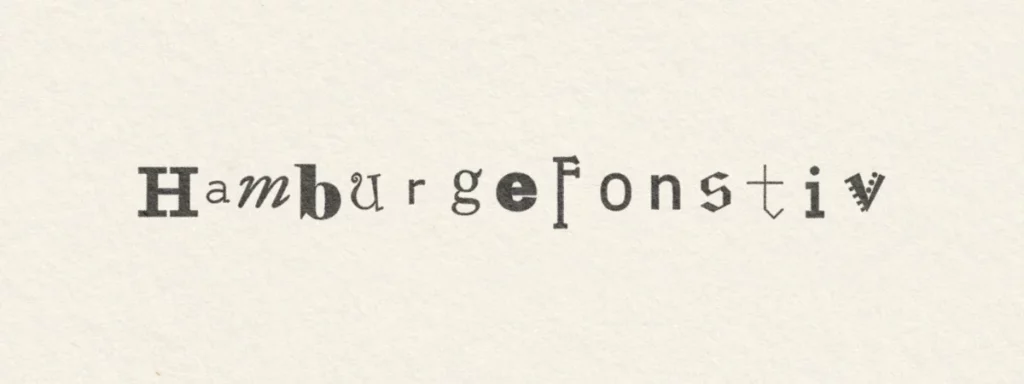
Use a good typeface
When you’re starting out in design, the temptation to use all those funky looking free fonts off the internet can be hard to fight. Most successful designers can count their favourite typefaces on their hands, however, and you’ll more than likely find that they are all famous, commercial fonts. The reason for this is that they are proven to be effective in a variety of situations, and are always clear and legible.
Don’t use too many fonts at once
Another giveaway of a beginner designer is the excessive use of multiple fonts on a piece. The reason why you may want to use more than one font, would be to create emphasis, or to separate one piece of information from another. For example, in a news article, you might want to display the body copy in a serifed font, and then the headline and quotations in a sans–serif.
Introducing more than say, three or four different fonts to your design makes it harder for a reader to understand what is and isn’t important.
Do not set text in capital letters
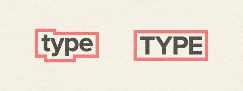
The outline illustrates the extra thinking capital letters involve
When we read, the eye quickly scans words rather than looking at one letter at a time. Lower case characters really aid this process with their ascenders and descenders making them easily distinguishable from one another. All caps has its place sometimes — such as in headings or logos — but reading paragraphs of copy set in that way is very tiring on the eyes due to its monotonous and uniform appearance.
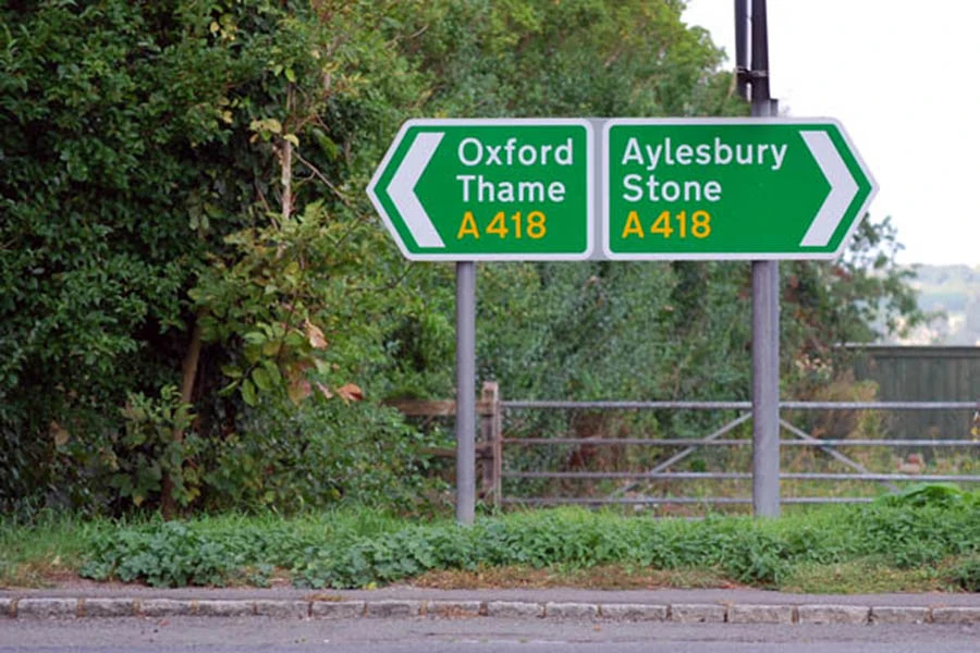
An example of a UK road sign. Notice the high contrast type, set in title–case for quick and easy reading
Signage, and any other information that needs to read and understood very quickly, should also be set using a combination of capitals and lower case characters.
Consider the length of your lines
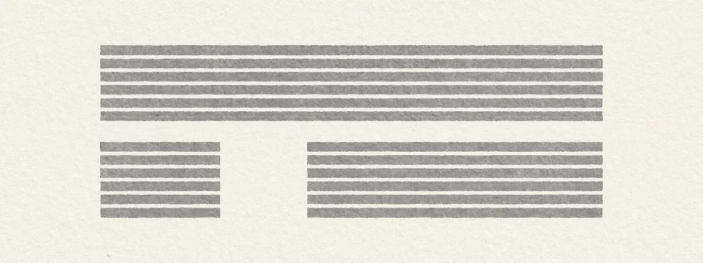
The top and lower-left paragraphs make life difficult for the eyes
When reading lines of text that are overly short or long, the reader will become weary fairly quickly. As the eye travels along long lines, getting down to the correct next line becomes difficult.
On the other hand, reading short lines of text creates quick, jumpy, eye movements that tire and annoy the reader. As a rule of thumb, aim for lines that are around 10—12 words long.
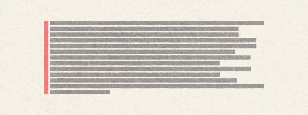
Watch your leading
Lines of type with too little, or too great a space between them, slow the reading process. The eye is going to either struggle to pick up the next line, or take big jumps between them… The exact amount of leading that looks ‘right’ depends upon the font size and even the typeface itself.
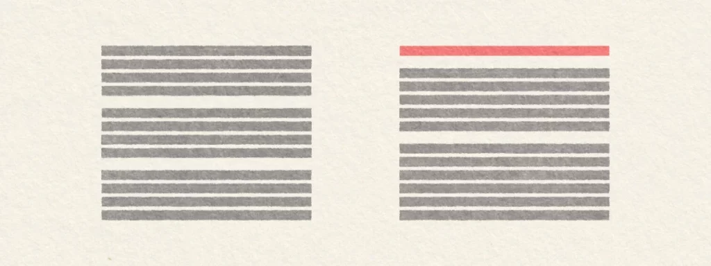
Use flush left, ragged right
Flush left, ragged right
Other methods of paragraph arrangement certainly have their uses at times. However, we learn to read with text that is set to an invisible left edge and with a ragged right side. The western language reads along lines from left to right, and so this makes perfect sense. Because of this, setting your type in that way is always going to be more legible.
Centered text is the enemy of legibility
Many people make the mistake of centering paragraphs to add interest to their work. In fact, not only is this harder to read (with no hard edge on the left) but is also, with its symmetry, the most passive and boring layout for typography possible.
Can you imagine reading a 400–page novel that was set ragged left, flush–right? Believe me, you would give up on that book fairly quickly — the ease of moving from line to line is very much compromised when they begin at different points on the page.
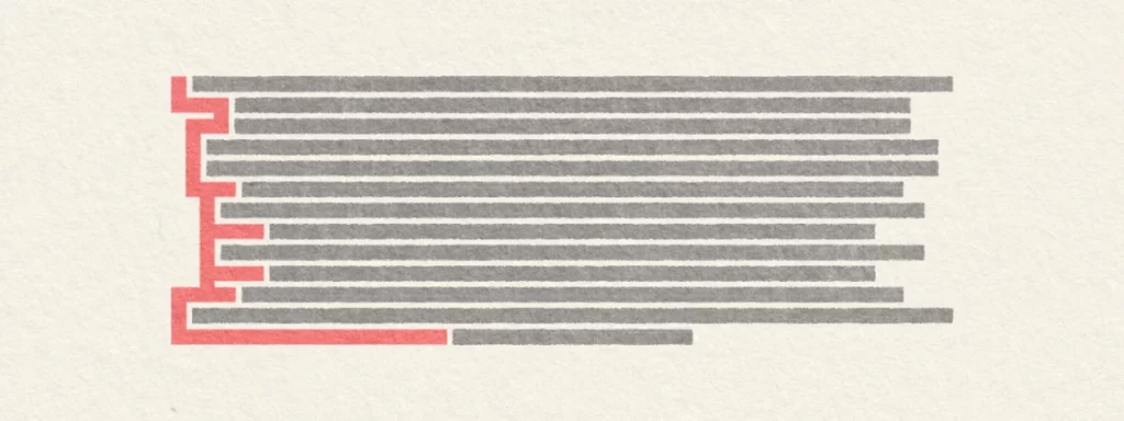
Avoid widows and orphans
Widow
A widow is a single paragraph–ending line, that occurs at the beginning of the next page or column, separated from the rest of the text its related to.
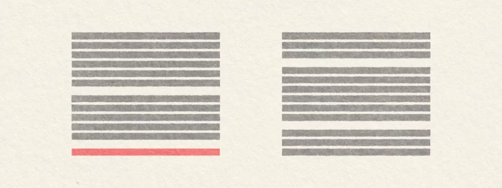
Orphan
An orphan is a single paragraph–beginning line that occurs on the page or column before its related text; or a word that appears by itself at the end of a paragraph.
Both of these should be avoided wherever possible, for they create spotty pages and break concentration in reading. Using hyphenation, line breaks or adjusting the tracking of your text are possible solutions to these problems; although most modern desktop publishing applications have an option to automatically avoid them altogether.
Always align to the baseline

Stacked Type
Letters are designed to exist alongside one another on an invisible baseline. When they are led from this orientation, they appear to be out of control and reading them becomes very difficult. If you want your text to be quickly digested, never stack letters upon each other.
—
Header Image: Maroquotidien Plus on Unsplash.