I have personally spent way more money than I care to admit on fonts. There wasn’t much available for free when I started out, so building a library of quality fonts to work with was an expensive endeavour.

These days with the likes of Google Fonts, there are lots of well drawn and fully-featured font resources available for free, so new designers won’t necessarily hit the same walls I ran into.
This post shows some of the best free fonts for designers that I have seen. They are all free to use in any project, however, please refer to the vendor/creator for details as the terms could change over time.
Free sans serif fonts

Manrope / Multiple weights + variable font (Bold weight shown) / Download
Manrope is billed as a ‘modern sans-serif for everyone’. Available in seven weights and as a variable font, the family appears to share some characteristics with Univers and Akzidenz-Grotesk, but definitely possesses a style of its own.

Cooper Hewitt / Multiple weights (Semibold weight shown) / Download
This font was designed by Chester Jenkins for the Cooper Hewitt museum rebrand, and it bears some resemblance to his Galaxie Polaris release. In the spirit of the institution this eponymous font was made open source on release.
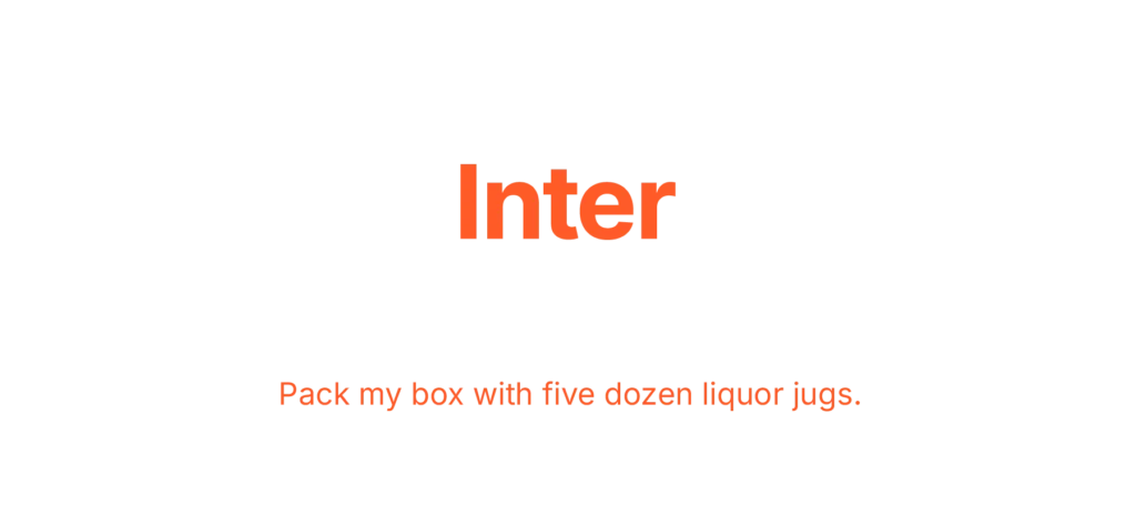
Inter / Multiple weights + variable font (Bold weight shown) / Download
Actively developed by Rasmus Andersson, Inter is a nine-weight family designed primarily for computer screens.

Sora / Multiple weights (Bold weight shown) / Download
Sora was designed by Jonathan Branbrook and Julián Moncada for Soramitsu, a Japanese company that specialises in blockchain development. It has eight weights and was created to be effective and clear at any size.
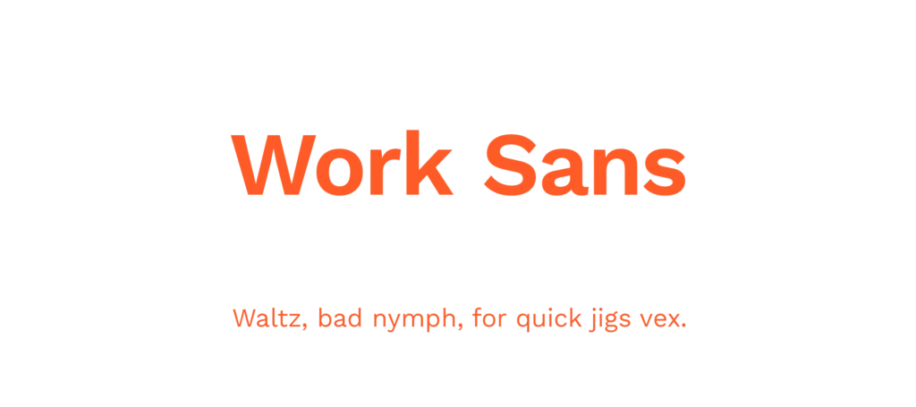
Work Sans / Multiple weights + variable font (SemiBold weight shown) / Download
Designed by Wei Huang, Work Sans has nine weights and a variable font. I particularly like its appearance in body text.
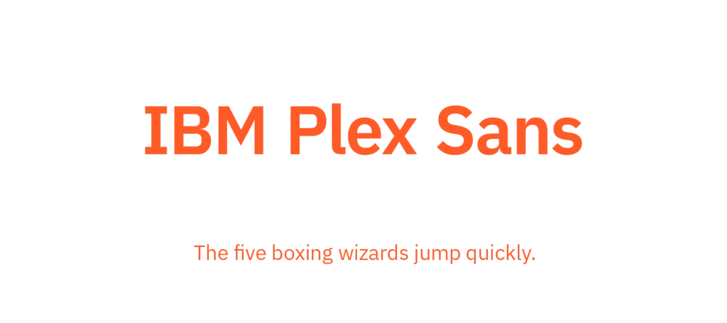
IBM Plex Sans / Multiple weights (Bold weight shown) / Download
IBM Plex is an open source superfamily designed by Mike Abbink of IBM, and Bold Monday; with the intention of replacing Helvetica as the company’s corporate typeface after over fifty years. It mixes curves and right angles for a unique appearance. The Plex family also includes condensed, monospace, and serif, and you can find out more about this family on its dedicated microsite.

DM Sans / Multiple weights (Bold weight shown) / Download
DM Sans is a geometric sans-serif developed by Colophon Foundry using the font Poppins by Jonny Pinhorn, as a base. It has three weights and was intended for legible use at smaller sizes.

Rubik / Multiple weights + variable font (SemiBold weight shown) / Download
Rounded cornered sans-serif Rubik, was designed by Hubert & Fischer for Google as part of the Chrome Cube Lab project. It has five weights, a variable font, and also a monospaced variant.
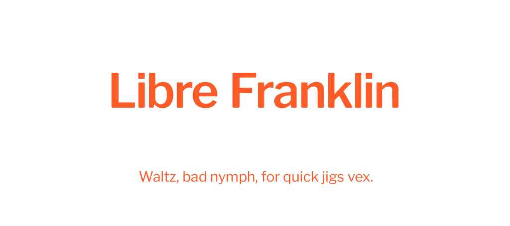
Libre Franklin / Multiple weights + variable font (SemiBold weight shown) / Download
Libre Franklin is an open source expansion of Franklin Gothic, which itself was designed in 1912 by Morris Fuller Benton. Impallari Type developed this nine-weight and variable font update of a true classic.
Free serif fonts
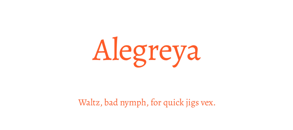
Alegreya / Multiple weights + variable font (Regular weight shown) / Download
Designed by Juan Pablo del Peral for Huerta Typográfica, Alegreya is an interesting six-weight serif family that also has a variable font and a sans-serif sister family.
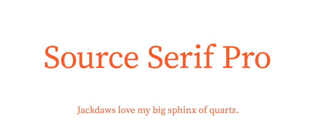
Source Serif Pro / Multiple weights (Regular weight shown) / Download
Source Serif Pro was developed by Frank Grießhammer to complement Source Sans Pro, for Adobe. There are six weights available in this family.
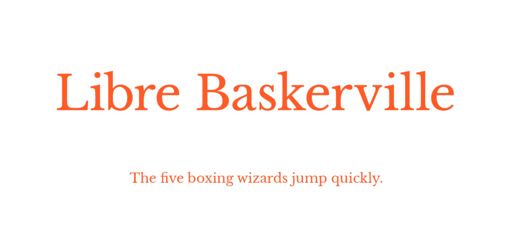
Libre Baskerville / Multiple weights (Regular weight shown) / Download
Another font from Impallari Type; this one revisits the Baskerville typeface which dates all the way back to England in the 1750s when it was designed by John Baskerville. Baskerville is a beautiful serif typeface which unsurprisingly has seen many interpretations through the years (notably Mrs Eaves, by Zuzana Licko, which squashed the x-height and achieved great popularity). Libre Baskerville has been optimised for body text, allowing for easier reading on-screen.
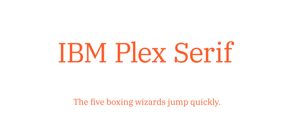
IBM Plex Serif / Multiple weights (Regular weight shown) / Download
Inspired by Bodoni and Janson, this is the serif version of the IBM Plex superfamily, which also includes condensed, monospace, and the aforementioned sans-serif.

Merriweather / Multiple weights (Regular weight shown) / Download
Designed by Sorkin Type, Merriweather is another serif typeface created with screen-use in mind. It has four weights and a closely-related sans family.
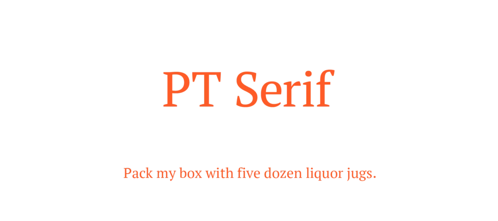
PT Serif / Multiple weights (Regular weight shown) / Download
Designed by ParaType for use together with PT Sans, PT Serif is a transitional serif typeface with humanistic terminals.

Lora / Multiple weights + variable font (Regular weight shown) / Download
Cyreal designed Lora with brushed curves, inspired by calligraphy. Coming in four weights and a variable font, Lora is intended for body text – working equally well for screen and print applications.
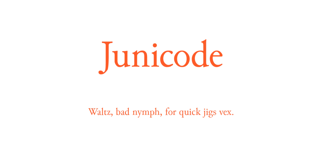
Junicode / Multiple weights (Regular weight shown) / Download
Junicode (short for Junius-Unicode) is a very interesting font project. Stated as being a solution for problems faced by medieval scholars; the font project aims to encode special characters found in Latin, Runic, and Gothic texts.
Free display fonts
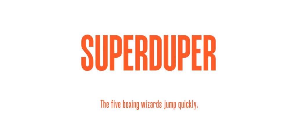
SuperDuper / Multiple weights (Bold weight shown) / Download
Designed by Asaf Hagag, SuperDuper is a four-weighted condensed font, that gives great impact when used in headlines and short paragraphs.
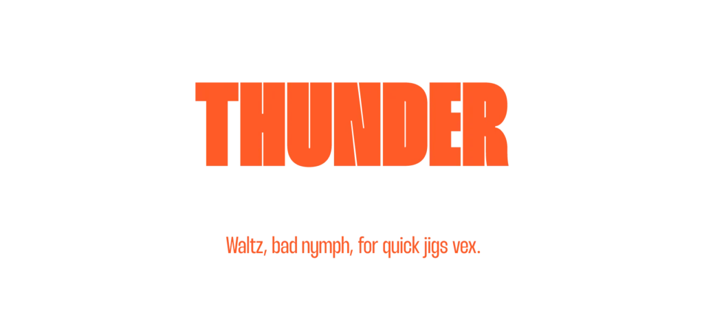
Thunder / Multiple styles and weights (Black LC weight shown) / Download
Thunder was developed by Rajesh Rajput. It is a very unique looking condensed font, that has two sets (low contrast / high contrast) of nine weights. There is an animated showcase page here.
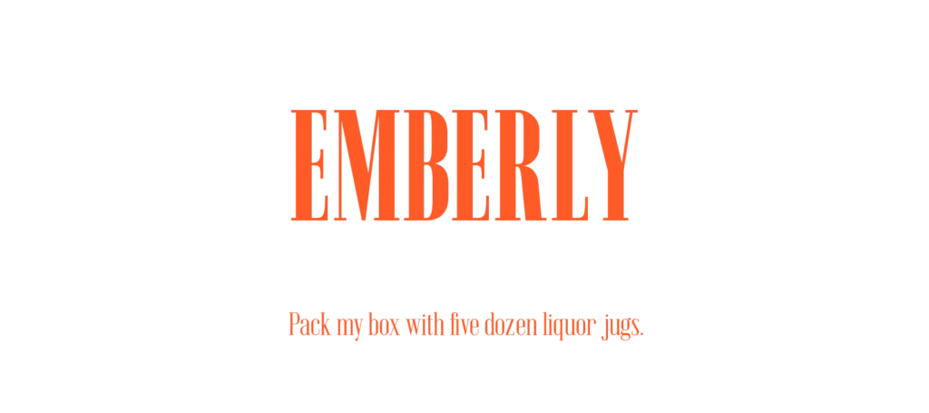
Emberly / Multiple styles and weights + variable font (Extra Bold Condensed weight shown) / Download
Emberly is another font designed by the prolific Rajesh Rajput, and is inspired by Didone style. It comes in three different widths, with multiple styles for each, and a variable font too. You can see some lovely usage examples in this showcase page.
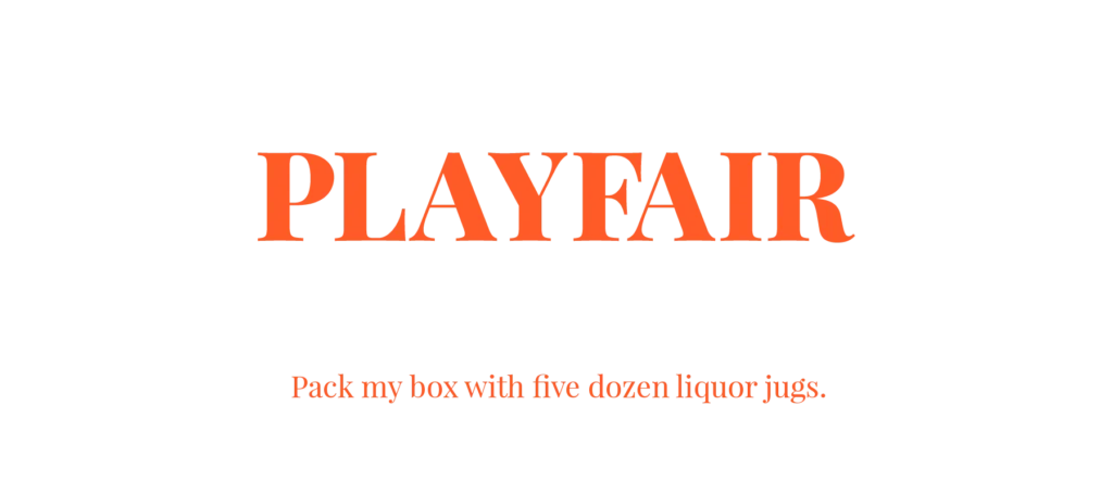
Playfair Display / Multiple weights + variable font (ExtraBold weight shown) / Download
Playfair Display mixes bold strokes with delicate hairline details, and is part of a project led by Claus Eggers Sørensen. It has six weights and a variable font.
—
Header Image: Alice Donovan Rouse on Unsplash.